Modular watchfaces
Published by Ken Wilson,
I love my Apple Watch and personal productivity. I like options and love to optimize my system. Endless tweaking. I’ve settled on these three screens to manage my daily habits. Color help distinguish which screen is which.
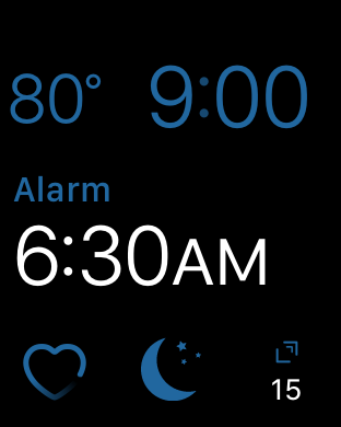
Night

Blue is for night. Sleep tracking is bottom center, weather (in case I wake up wondering "hmm, how cold is it outside right now?"), heart rate, *alarm, and Drafts. Drafts is ever present. It’s my universal capture point for any and all ideas. Sometimes ideas him me in the middle of the night.
*I charge my watch before bed and use the watch to track sleep and as an alarm clock. No audible alarm means (1) it’s not as assaulting in the morning and (2) Meg can sleep in without me disturbing her. It’s like I’m a ninja 😶.
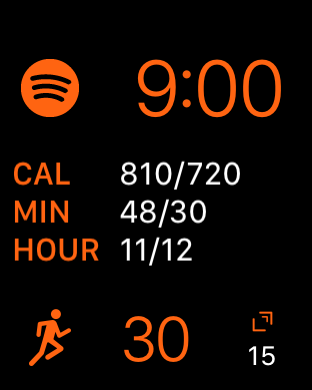
Morning (gym)
After I get up, make coffee, and read my Bible, head to the gym. I switch to this face as I head out the door.

Orange = active! I listen to Spotify, start workouts from the bottom left icon, and use the "clicker" app to count the number of sets if I’m lifting. Drafts in the bottom right.
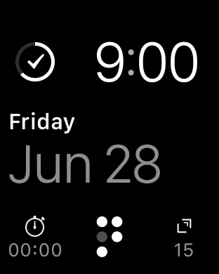
Day
This is the primary face I use all day. Things is my go-to productivity app. I use the stopwatch countless times a day for various reasons. (Ok, it’s my coffee timer ☕️ ⏲). Drafts again. And I use Streaks to keep track of daily habits.

That’s it! I use a few other "pretty" watch faces on the weekend and just for fun, but these three (and their colors) work pretty well for pure productivity and functionality.
